

David Pascal: A Portfolio Of Book Cover Designs
As both a writer and a designer, there's probably no project in the world I like doing more than designing book covers.
 I've done it for private clients, for academic
clients, for firms and publishers. I've worked with print-on-demand
publishing houses like Lulu and created ebook jackets for ebay.
I've done it for private clients, for academic
clients, for firms and publishers. I've worked with print-on-demand
publishing houses like Lulu and created ebook jackets for ebay.
Sometime (as with the cover on the left) I've even written the text myself and then created the book cover.
Each time it's a joy.
Below are some recent (and a few not-so-recent) book covers that I've done. Have a look.
And if you're wondering if I'm available to do a book cover for you personally -- I'm always available to do a book cover.
Contact me to find out more.
This cover was for the Bronx County Historical Society.

The Bronx has been at the center of American History
since before the Revolution, and the Bronx County Historical
Society celebrates that heritage in ways ranging from tours, radio,
cable TV, concerts, expeditions, lectures, and art shows to -- of
course -- publishing some of the best scholarly and popular
publications anywhere that have the Bronx as its subject.
This cover was also a challenge because the one same cover had to a very
wide range of historical subjects relating to the Bronx.
Eventually we settled on an evocative old 1882 print that seemed to catch the essence of the place. With just a little image modification, classics like The New Parks Above The Harlem above, rolled off the presses.
Below is a sketch for an earlier version that didn't make it. (There's a Flatiron Building in the Bronx, but it wasn't the one on the cover below! Still, I liked this earlier version.)

The cover below was created for one of Canada's finest colleges: McMaster University in Hamilton, Ontario.
 It was for a University Library project
to reprint classic editions, and it's particular favorite of mine,
because the first book in the series was H. G. Well's The Time
Machine, the first book I ever read.
It was for a University Library project
to reprint classic editions, and it's particular favorite of mine,
because the first book in the series was H. G. Well's The Time
Machine, the first book I ever read.
The project was interesting too because it involved making another series cover -- a cover that can serve as the book jacket for every book in the series. And the scholarly series that might emerge from McMaster University Library's extraordinarily rich selection of books was immense.
If you can imagine designing a cover that can fit Newton's Principia, Dracula, and Winnie The Pooh, you begin to see the challenge.
Fortunately McMaster is a beautiful university -- full of green boughs, noble naves, and scholarly ivies. A photo of one of their doorways, suitably photoshop'd to a give it a watercolor feel, atop a stately Trajan font, provided a solution.
Working with the people of McMaster University on the project was an added pleasure. I found myself becoming quite a fan of the institution -- their web site and Library are well worth a visit.
The next cover was commissioned r-spec, a writer's association working in conjunction with Big Pencil Press. The idea was to take a major Northeastern American city and give eighteen fictional treatments of what that urban future might be. An interesting project, with implications for every city in the globe.
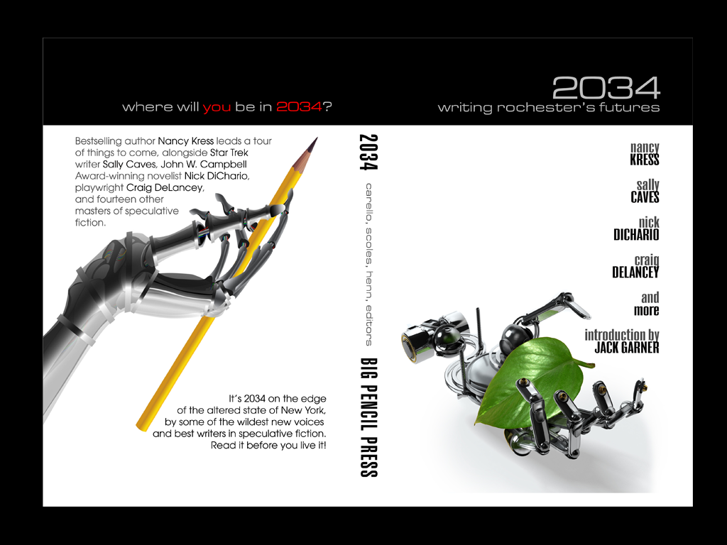
This became something of a pet project with me, and I ended up designing not only a series of variant covers that were very different from the final pick, but also laying out the whole book. Below is one of the rejected covers (which I kind of liked).

Below are a few covers for the Kirtas Classics Series.
Kirtas Technologies (the link takes you to their web site, which I designed as well) is a firm that has spearheaded the use of automation in book digitization.
Kirtas book digitization devices can capture digital images from bound documents with a speed and quality unmatched by any other equipment. Their clients have included universities, libraries, governments, publishers, and institutions ranging from Microsoft to the British Library to Moscow University to Yale.
And they can, and do, reverse the process, converting
book files into print volumes of high quality.
When the firm decided to create their own line of classic publications, I was asked to do the template and a number of the initial volumes.
Again, these covers were designed to be generic -- that is, one cover was intended to serve as the jacket for various books in the same general subject area.
The first template (above) was for books related to the arts. The cover below is for the Culinary Series:

The The next three below were for the Civil War Series:


This last one was a discarded sketch for Johns Hopkins University. Alas, it didn't even go up for approval! But it hit the medical-academic note quite well, I thought.


A long story behind this one, as you might expect with anything originating from the former Soviet bloc!
This jacket was originally for a book regarded as something of a mix between espionage fiction and experimental literary fiction by a poet and author with East german roots. This first cover led to a few more, but so far the books aren't on the book shelves yet.

Suspense fiction by Abbe. This one involved a homicidal East German hausfrau in the late Fifties. Grim plot line, but the stuff of fine visuals!
Most book covers go through a long process during which input is given and original ideas are modified, sometimes beyond recognition. These are a few that fell by the wayside.
I hope they'll find a home on a book of their own one of these days. But till they do, here they are -- along with a little glimpse inside the design workshop:

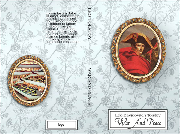
I had gotten an assignment to do a cover design job for a series of classics, and I assumed each classic would have it's own jacket. So I started with War And Peace. Unfortunately they went with one generic cover for all, and my Napolean covers encountered Waterloo.

This was intended to be a cover for a local Poetry Anthology.

After I had given a talk to writer's group in Rochester, New York, someone suggested that it would be nice to get a selection of Rochester poets together and do a print anthology. I agreed. Eons passed.
Then while talking to another local poet suddenly the idea of the cover to the left hit me, and before I knew it I had come up with the cover and saved it to disk.
And that's where it sits to this day.
(By the way. The title lines? By Charles Bukowski, of course.)

The rest of this stuff? Either on-spec stuff to get my
foot in the door, or ideas for book jackets
that got passed over for some reason or
another. I like 'em too much to just keep them in the desk drawer.


Six cover designs for the literary journal Unreal City. Not really book covers, but close. It's been semi-officially suggested that I do the print anthology cover one of these days, along the same stylistic lines.
I have a real affection for this last cover, though it isn't remotely the best of the bunch. In fact the finished design doesn't even look like this -- what you see here is just a sort of first sketch.
So why am I including it? Because it's the first book I ever ghost-wrote. And ghost-designed too!
This was the first book I ever created for a client from start to finish -- discussing the germ of the idea, helping the author develop it, shaping the prose, editing and proofing the copy.
And once the mere text was done? Then I laid out the page design, did the cover, took the finished package to a publisher, and then did the marketing legwork to put it in front of the public.
Some ghostwriters help you write the text. Some designers do the jacket. Some desktop publishers lay out the pages. Some agents take it to a publisher. And some marketers take it to the public.
But how many of us get a chance to do it all?
This job was an education: my first experience of total book creation from idea to physical hard copy. The shape of publishing to come.
So -- need a book cover? Of course you do! Call me at 585 - 643 - 1167. Or drop me a note from my contact page.